Search This Blog

Friday, December 24, 2010

Fear the Krampus!


Here's a beer label that I did for my cousin, Jack. Named "The Krampus" after the mythological anti-Santa Clause of Austria (look him up on Wikipedia, there's some crazy stuff on this character). I felt kinda guilty that I wasn't able to finish my Christmas card for this year so I thought that this would make a good alternative.

Happy Holidays, folks! :)

Thursday, December 2, 2010

Elephants


Some warm up studies of elephants. Thought it'd be a good idea to start studying animals too.

Tuesday, November 30, 2010

He will be known as....Pekk!


Just a little cartoon drawing before I continue on to a freelance job. You'll notice that the black and white image has some ugly smudges on it. That's from the felt marker colors bleeding through (I colored it on the other side). I suppose I could've cleaned those up but I wanted to get this image up and I figured I'd show the original pencil drawing too.

I think I'll start coloring these digitally. I'm just too sloppy with the felt markers. :-P

Monday, November 29, 2010

Thursday, November 18, 2010

Something for the ladies.


A little something I made for fun. Part of a little personal project of mine. Need to work on the markers. Kinda sloppy. :-P

Thursday, November 11, 2010

Blast from the Past!


My aunt sent me an old illustration that I made when I was about 19 or 20. One of my first gigs! Kind of embarrassing but I thought I'd share it anyway! :)

Tuesday, October 26, 2010

Been a while since I posted a caricature...

For my buddy, Joel Hasse.


To be honest, this was actually based on a photo of Joel's which was digitally altered. I suppose this is more of a caricature of a caricature. :-P

Inked in Flash, colored in Photoshop. Sketched by MAGIC!

Sunday, October 24, 2010

Love Birds Color Studies


Just thought I'd play around with the Woodpecker's color scheme. Even tried doing a colored outline but I think I'll hold off on that.

Sunday, October 3, 2010

Some CG Animation


I've been experimenting a bit with some CG. I know alot of these shots are pretty rough since I wasn't used to using the graph editor just yet. Still thought it'd be nice to show.

The first shot is from a final I made from a CG class. It was longer but I could only clean up so much of it for a reel. I have since lost the original file. DOH!

The rest of the shots are from an animated short, "Soup of the Day". As I am writing this, the short is currently in post production. If it gets finished, I'll link to the short and hopefully be able to update this reel.

Sunday, September 26, 2010

I's Can Sculpt!

Here are some sculptures that I made a long time ago. This is one of the first incarnations of Zoot Manhattan. He was pretty much a caricature of Dean Martin, one of my favorite singers (I'm a big fan of the Rat Pack).


I actually really liked how this one turned out.

Next up, we have another original of mine, the Jolly Bomber!


He was made to be a comic book villain. There are some flaws but I had fun coming up with the character and sculpting it. Man what a huge ass!


Thursday, September 23, 2010

Dr. Robotnik!


Roughed it out on an index card, cleaned it up with mechanical pencil on the back. Colored in Photoshop.

Wednesday, September 22, 2010

Love Birds Revisited!


Still some flaws but I like how this one looks more. Actually, this is how I'd like the final scene to look. What do you guys think?

One thing's for sure, I could sure use some practice on my backgrounds. Think I'll work on that some more.

Tuesday, September 14, 2010

Let's get Dangerous!


Roughed out on one side, inked on the other. Colored in Photoshop.

Next time, I'll scan it in as a black and white image. May do away with a lot of the roughness.

Monday, September 13, 2010

Updated Love Birds progress...

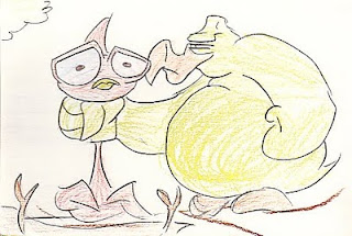
Okay, here's a step by step progress. First I studied the original panel that inspired the last image.

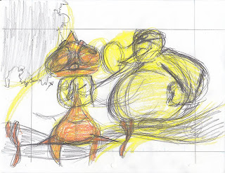
Then, I made a rough (very rough) layout of the image on a 8.5 x 11 sheet of paper. I tried keeping things within a 6 x 8 in. box (usually the ratio when I normally animate).

After that I tried tying everything down on their own layer (not scanned). When I finished, I started doing a tonal study based on the original storyboard panel.

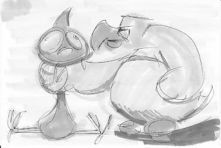
Once I was finished, I did a tonal layer to each of the tie downs. I also added a black outline to the characters.

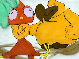
Finally, I added color in Photoshop. I used the same color scheme from the last image, since I kinda liked how that looked. I also cropped the image based on the ratio that I applied. Here's the final result.

My thoughts:

Layout: Shouldn't have settled on the first drawing. Should've made sure that the characters (the most important part of the scene) fit within the scene. Too much of them break out and it looks sloppy. Maybe start with the character's general shape and then build the background around them? I should also study tree branches. Even for a cartoony design, these look kinda weird.

Tonal Study: I actually kinda like how this looks. I don't know if it's helping me as much as I'd like it to, though. It does help figure out the composition. Perhaps I should do a color study as well.

B/W Art: This should probably be called grey scale art. :-P Need to practice on the outlining of the characters. The contrast on the greys looked pretty good when before I scanned them. Maybe I need to up the contrast a bit? Maybe I should go straight to colors?

Color: Maybe I should skip the whole Grey Scale/Photoshop color deal and try coloring them as a final clean up instead. I just don't like the result of this. Other people pull it off really well but I think I'm missing something.

I don't want to give up on this image just yet. I'm gonna give a few more tries. After that, I'm going to start working on other aspects of this short, whether or not I perfect this!

Wish me luck. :)

Friday, September 10, 2010

Love Birds posting!

I have a few shorts all nice an' story boarded and now that I'm done with school, I have the time to work on them!

Here's a story board panel from the short, Love Birds. This was done a while ago.


I tried to do a clean-up of it (the characters on one layer, the background on another) with Micron Pens and then do a tonal study with some grey felt markers.


Then I done-did the colorins in that fancy ass program, Photoshop!


Ehhhh, needs a little work. Maybe next time I'll work on a larger medium. I need to pay more attention to the general shape of the characters. There are some ugly lumps and bumps here and there. I also should have built the shading from the inside out, starting out with a light grey general shape and getting darker as I tie down the volume. Doing it the opposite way caused some nasty smudges here and there.

Oh well, practice makes perfect. :) I'll probably post the rest of the story boards later.

Tuesday, August 24, 2010

More sketches.


Fan art of video game and cartoon characters...because I'm totally not a nerd. Enjoy!

Sunday, August 15, 2010

Felt Marker Sketches


Been practicing with felt markers lately. Just thought I'd post a few sketches here.

Friday, August 6, 2010

Some character designs...

Some character designs that I made a while ago, for a class. These three in particular were my favorites. Here are both the roughs and finishes.


Tuesday, June 22, 2010

Ball Bouncing Fun!


Little something I whipped up in Flash. Basically just an exercise in layout, timing and animating straight ahead.

Here's another one:


This one's a little simpler. Just playing with the squash and stretch.

Monday, June 7, 2010

Cockatiel!


Sketch of a cockatiel. Colored in Photoshop. Just a heads up, I tend to favor drawing birds. You'll probably be seeing quite a few them here.

Saturday, June 5, 2010

Hubba hubba!


Kind of a stock pose of mine but I just wanted to play around with Flash. I like the colors of this character.

Sunday, May 30, 2010

Who the heck is this?!


Before and after shot. Just a sketch that I decided to ink and color in Flash.

Friday, May 7, 2010

A little sketch of myself...


I made this while sitting in on an animation class. This was inspired by all the beer runs I was doing with my buddies while graduating from AI. Since I got my new scanner today, I thought I'd play around with this a bit.


I thought a loose painting job would fit with the loose sketches. I'm going to try to make more of these little cartoons. They are a lot of fun.

Flour Sac Finished!


Flour Sac, inked and colored!

I tied this down straight ahead and then colored it. This was fun and I'd like to use this approach for future projects but there are a few things I clearly need to work on.

-My line work definitely needs to be refined. The rough edges are pretty distracting and it made the sac harder to color.

-Certain poses could use a bit more thought. I don't know how obvious it is in this but the sac's push off looked a little awkward when tying this down. I suppose I could fix this during the thumb-nailing process.

All in all, I had fun doing this and I'm going to push myself to work on these things at least once a week.

Monday, May 3, 2010

A little something I whipped up in Flash...


Trying to get more practice drawing with my Cintiq. Here's the animation roughs of a flour sac. I'll tie this down and color it later on. I want to get into the habit of doing this daily.

Monday, April 5, 2010

Some Illustrations of Mine.

Just thought I'd show some illustrations of mine. These were all for an illustration class.

Here's one that's a caricature of Micheal Buble. We were supposed to do a celebrity and their pet. I don't think he has a pet parrot, I just thought the image was funny. It also kinda made sense since he's a singer.

Another one of my assignments was to illustrate a poster advertising a stage adaption for George Orwell's "Animal Farm".

Our final was an advertisement for the Honolulu Marathon 2010. Again, I shoot for funny. I also wanted to see if I could illustrate without relying on a solid black outline.

These were all hand drawn and colored using Adobe Photoshop.


Friday, March 19, 2010